

We understand that the right colour can transform a space, bringing energy or even a touch of whimsy.
In this blog, we’ll delve into the versatility of Splashing and explore our favourite colour pairings, suggesting the best room orientations for each to help you incorporate this chameleon charm into your home.
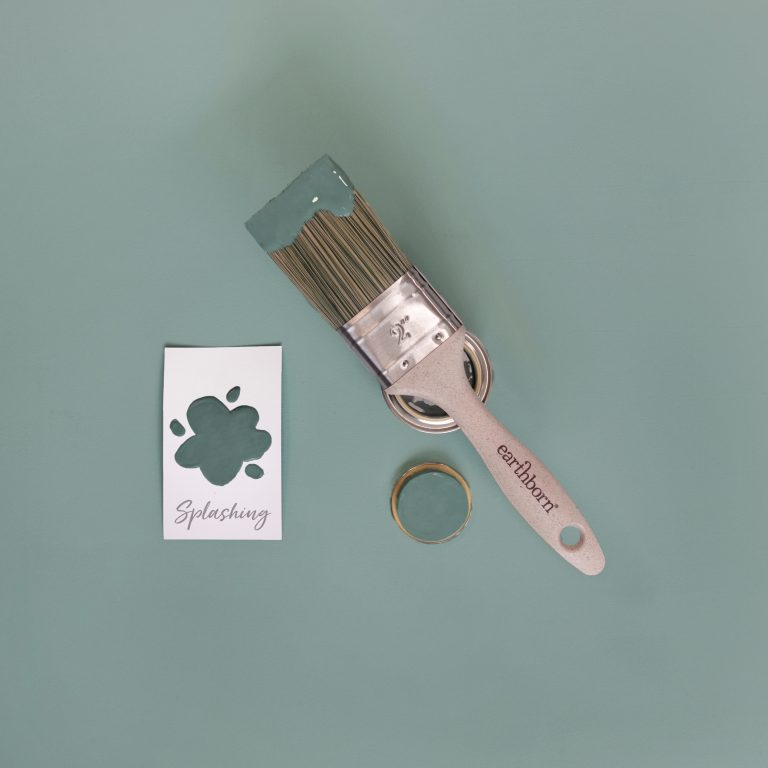
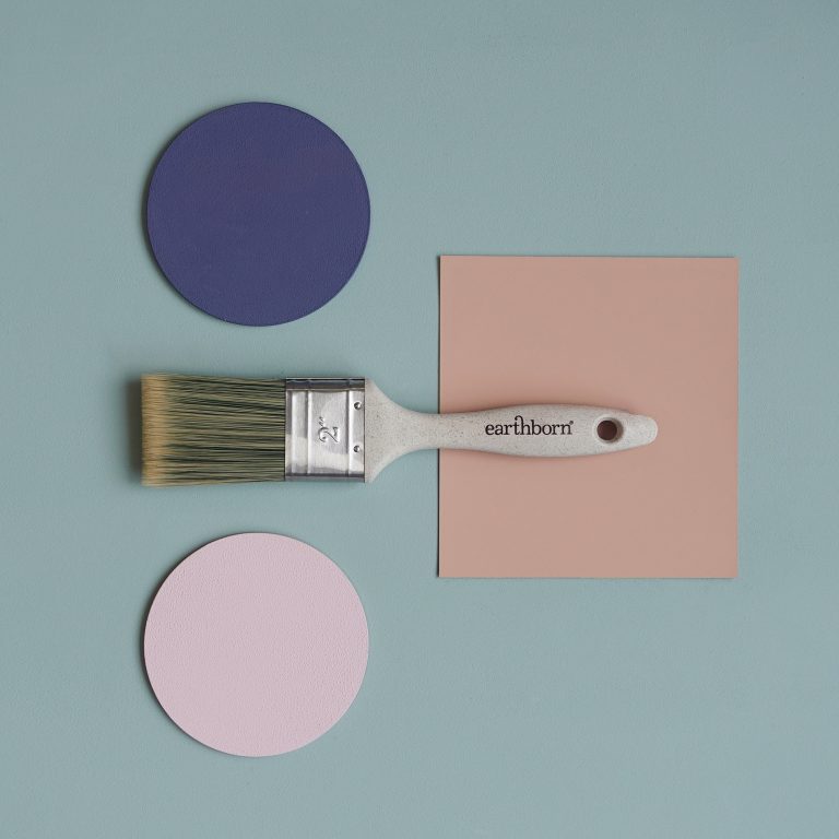
Appearing more blue or green depending on the light, Splashing is perfect for creating soothing spaces or adding a splash of colour to a neutral backdrop.
Which makes it an excellent choice for creating a lively and welcoming environment.
Whether you want to make a bold statement or add a touch of colour, Splashing is a versatile shade that can enhance any space.
To highlight the beauty of Splashing, we’ve curated a selection of complementary and contrasting colours, to help you bring this vibrant colour into your home.
Complementary Warm Neutral Pairings
Pair Splashing with the earthy tones of Little Rascal and Straw for a warm, inviting combination. These colours create a harmonious balance, with Little Rascal providing a rich, earthy foundation and Straw adding a subtle, sunny contrast. This pairing works beautifully in living rooms, dining areas, or even kitchens where you want to create a cosy, welcoming atmosphere.
This particular Splashing pairing is best for North facing rooms as the warm neutrals linger and brighten when natural light is not at it’s best. Try Splashing on an accent wall in your living room or dining area, complemented by Little Rascal or Straw on the remaining walls and pops of red in furnishings and accessories.
This scheme creates a balanced, inviting space perfect for gatherings and relaxation.
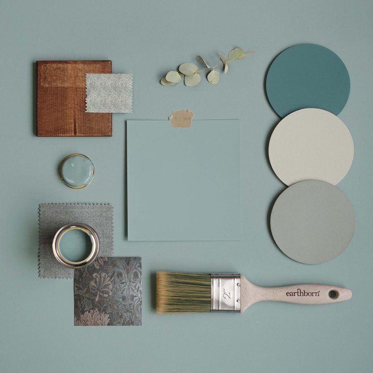
Harmonious Colours Pairings
For a cohesive and calming look, combine Splashing with the earthy greens of Hobgoblin, Grassy, and the muted tone of Gregory’s Den. These colours blend seamlessly, creating a serene and grounded atmosphere. This combination is ideal for bedrooms, bathrooms, or living rooms where you want to evoke a sense of calm and harmony.
Use Splashing on the walls, with Hobgoblin and Grassy as accents in or artwork. Gregory’s Den can be introduced through larger pieces of furniture or features, enhancing the room’s peaceful vibe.
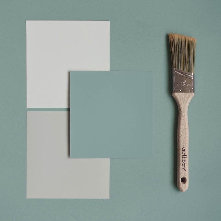
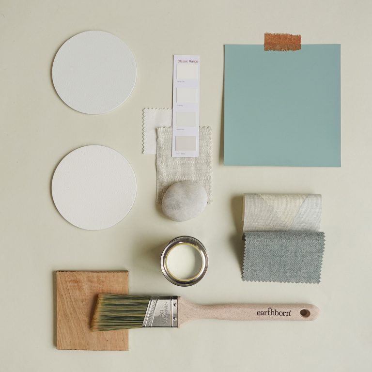
Complementary Cool Neutrals Pairings
Create a cool, contemporary feel by pairing Splashing with the soft tones of Cat’s Cradle and St John. These cool neutrals balance the vibrancy of Splashing, providing a serene and sophisticated backdrop. This pairing is perfect for bathrooms, bedrooms, or offices where you want to foster a sense of tranquillity and modern elegance.
This Splashing Pairing is best for a South facing room orientation as it helps to balance the flood of natural sunlight. Paint the main walls in Cat’s Cradle or St John and use Splashing for trim, shelving, or accents. This combination will make your space feel fresh and inviting, ideal for relaxation and concentration.
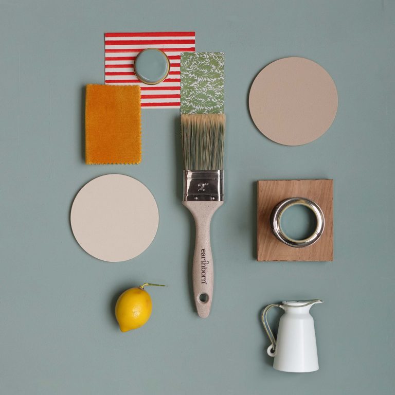
Contrasting Pairings
For a bold and energetic look, pair Splashing with the bright and cheerful, contrasting colours of Trumpet, Rosie Posie, and Flora’s Tale. This combination creates a lively and dynamic atmosphere, perfect for spaces where you want to inject creativity and fun, such as home offices, playrooms, or feature walls.
With contrasting pairings we suggest using Splashing as the main colour and introduce Trumpet for striking accents, Rosie Posie in accessories, and Flora’s Tale in smaller accents or artwork. This combination will energise any room, making it a vibrant and inspiring space.
Whites Pairing
For a fresh and airy look, pair Splashing with the crisp whites of Seagull, Sandy Castle, and the delicate tones of Flutterby. These whites enhance the brightness of Splashing, creating a clean, serene environment. This combination is ideal for kitchens, bathrooms, or any space where you want to create a light, breezy feel.
This particular room orientation works well in most room orientations as all of these colours work well to make your space feel open and airy, perfect for both relaxation and activity.
Splashing is a versatile and vibrant colour that can breathe new life into your home. Whether you’re aiming to create a bold statement, a calming retreat, or a playful space, this beautiful shade has the potential to transform any room.
By pairing it with complementary colours and thoughtful design elements, you can achieve a look that’s both unique and inspiring. We’re excited to see how you’ll use Splashing to enhance your home.
Let your creativity flow and happy decorating!


