For bare porous unpainted masonry substrates such as lime plaster, stone, pebbledash & concrete.
£5.00
£34.50
£60.00
For masonry substrates with previous masonry paint application.
£52.00
£86.00
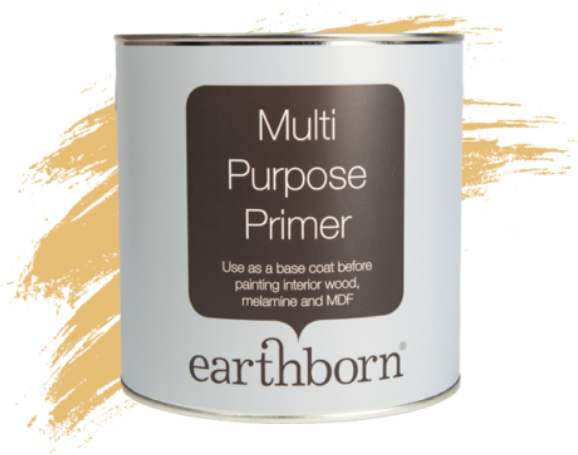
Earthborn Multi Purpose Primer provides a perfect base coat on interior wood, melamine and MDF surfaces.
£22.99
Over the past few months we’ve written a series of blogs in collaboration with Lincoln Conservation about historic paint colours. In our last post we looked at authentic paint colours for Edwardian properties. And in this post we’ll take a closer look at Twentieth Century paint colours.
Lincoln Conservation specialise in the conservation and restoration of interior and exterior features. They work on listed and historic buildings, historic artefacts and carry out historic paint analysis. Together with the team at Lincoln Conservation, we’ve created a range of colour palettes suitable for different eras of property, including 20th Century paint colours.
The 20th century saw a boom in the use of ‘colour science’ and ‘colour psychology’ to select interior colours. During the 1950’s in particular, a scientific approach to design was in vogue.
Hallways were ‘the handshake of the house’ and were often painted a warm, inviting colour – try Peach Baby for a gentle blush tone.
Rooms to relax and heal were often painted in a soothing blue; think light blue Bo Peep or Polka Dot, with its easy going vibe. And places to be productive were a colour interesting enough to avoid boredom, but calm enough to avoid distraction.
In schools it was suggested that the blackboard wall was painted a slightly more interesting colour to draw the eye to the front. Wards with new mothers were advocated to be painted a warm and rosy colour to match the occasion of a new arrival.
In an age where creativity was encouraged, colour wheels were advertised to housewives so they could create the most harmonious settings for their homes.
In 1917 Howard Kemp-Prosser painted a ward room in McCaul Hospital for Officers, London. The walls and floors were a bright, warm yellow, the woodwork spring green, and the ceiling firmament blue. This extreme make over was to test the theory that colours had a certain effect on mental health.
Every decade of the 20th century is associated with certain interior colours. From the black and white chequerboard floors of the twenties to Mamie Eisenhower’s 1950s pink bathroom (in fact, the Mamie loved pink so much that the White House became known as the Pink Palace!), to the oranges and browns of the 1970s… This century saw an explosion of individuality expressed through decor. Here’s some of our favourite twentieth century shades:
Some styles might have changed but these 20th century ideas on choosing the right colour for the right space are just as relevant when decorating a home today. Why not order an Earthborn Classic Colour Card here to get your decorating plans started?