For bare porous unpainted masonry substrates such as lime plaster, stone, pebbledash & concrete.
£5.00
£34.50
£60.00
For masonry substrates with previous masonry paint application.
£52.00
£86.00
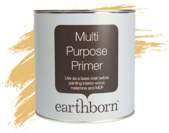
Earthborn Multi Purpose Primer provides a perfect base coat on interior wood, melamine and MDF surfaces.
£22.99
At Earthborn, we believe colour should feel joyful, expressive and a little bit brave. That’s why we’re so excited about our new collection of 12 beautifully curated shades, each one designed to spark creativity and breathe fresh energy into your home.
Today, we’re inviting you to take a bite of Pale Pip, a gentle, modern alternative to white that proves neutrals don’t have to be boring.
Inspired by the soft tone of an apple core, Pale Pip carries the lightness you love in a white, but with a subtle green undertone that gives it life. It’s airy. It’s uplifting. It’s effortlessly elegant.
If you’re craving a light filled space but feel uninspired by standard whites and off-whites, Pale Pip offers something quietly special. It works beautifully as the main shade in your palette, creating a clean canvas that still feels considered.
It’s the perfect backdrop for creativity. Painting your walls in Pale Pip instantly creates a refreshing atmosphere. It opens up a room while leaving plenty of space to layer in personality through bolder accents and contrasting trims.
Because it’s such a versatile neutral, it gives you the freedom to play. Keep reading for a few inspiring colour pairings from our range…
Pale Pip & Oliver Twig – Double down on green for a nature inspired scheme that feels calm and restorative. Perfect for living rooms or bedrooms that need a gentle reset.
Pale Pip & Balloon Ride – Add depth and drama with rich blue accents on doors or alcoves for a striking yet balanced look.
Pale Pip & Three Bears – Bring warmth and a contemporary edge with golden tones that glow against Pale Pip’s fresh base.
Pale Pip & Rosie Posie – A soft, romantic pairing that feels light, playful and ideal for nurseries or creative spaces.
Pale Pip & Mr Mole – For a modern monochrome moment, use inky dark trims or furniture to create definition and sophistication.
One of the joys of Pale Pip is its adaptability. In north facing rooms, its soft white base gently warms cooler light, helping spaces feel brighter and more welcoming. While in south facing rooms, the delicate green undertone balances strong sunshine, preventing the space from feeling stark or overly bright.
It’s also a wonderful choice for hallways and connecting spaces. Using Pale Pip throughout adjoining rooms keeps your home flowing seamlessly, cohesive without ever feeling plain.
Feeling inspired? We hope so. Pale Pip has a way of quietly stealing hearts.
If you’re still building your dream scheme, our handy 100ml sample pots are the perfect place to start. Test Pale Pip in different lights, on different walls, at different times of day.
Our painted swatches, created with real Earthborn paint, are also ideal for mood boards and colour planning. Move them from room to room and watch how the shades shift and interact with your space.
So go on! Pick up a brush, embrace something beautifully different, and let Pale Pip transform your home into a light filled, feel good haven.