Guest blog: Justine Fox talks interior trends and the psychology of colour
30th June 2016
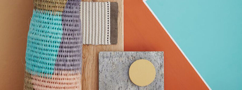
In our latest colour story Natribes we celebrate some unusual yet highly effective combinations, especially at the bolder end of the spectrum. Here, colour expert Justine Fox explains why some of us love a bright hue and others opt for more calming tones. Justine’s expertise stems from her experience in colour forecasting for businesses across a range of sectors. She uses trend forecasting in conjunction with applied colour psychology, and developing colour technologies, to identify and communicate her clients’ USP in their products and marketing.
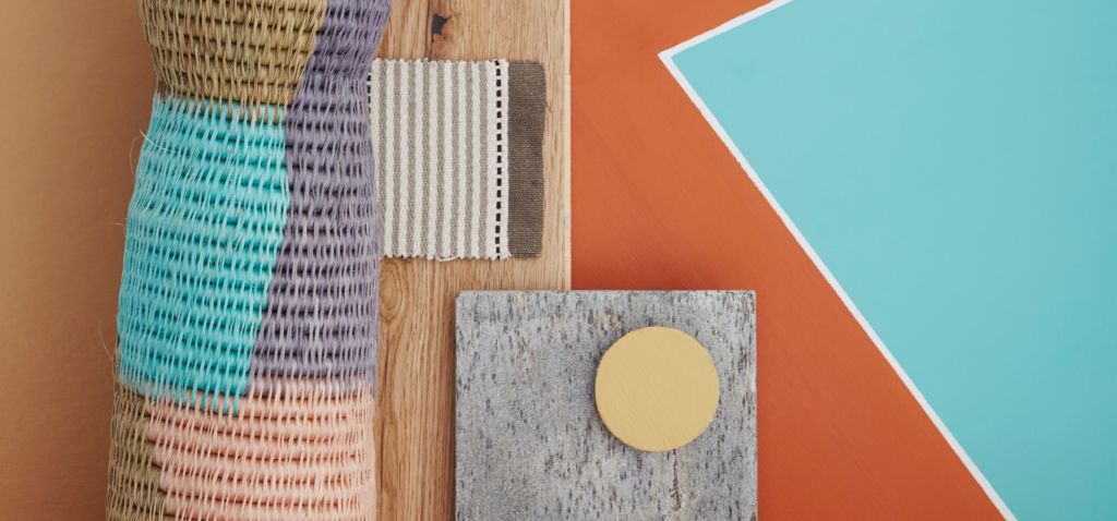
“What is it about colour trends? They’re really interesting for fresh ideas and a window on what’s new in the world, but why do some make our noses wrinkle where others seem to sing to our souls?
It’s really down to simple biology. You see colour is all in the mind. Our bodies respond to the light that creates this sensation of colour without us even thinking about it. What’s truly fascinating is that this processing happens in roughly the same part of our brains that scientists think our emotions are formed. Our emotional relationship with colour is intrinsically linked on a subconscious level.
There’s plenty of information around the Internet that will tell you to wear red if you want to feel more powerful or paint your hallway yellow for a welcoming entrance. These are great tips in general but don’t really take us as individuals into account. Alongside our core personalities, we develop associations through life that create our own unique internal colour language. Recognising which tints, tones and shades of these colours inspire and make us feel comfortable is the ultimate tool in decorating your home.
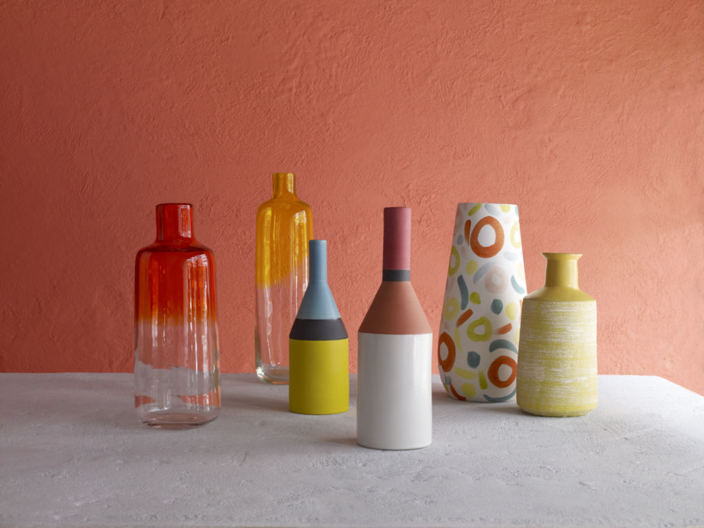
Complex tones add a sense of history and provenance to playful mark-making and hand-crafted textures in these vessels from Habitat.
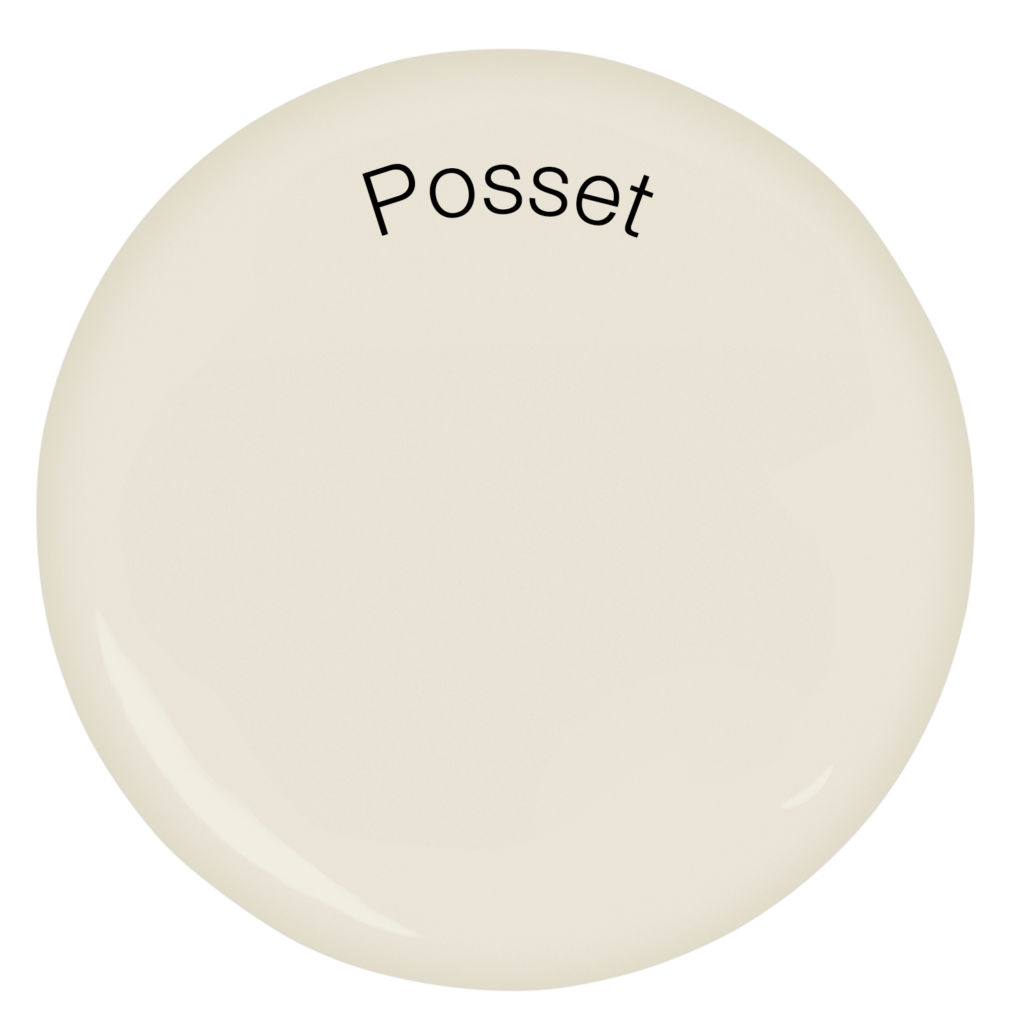
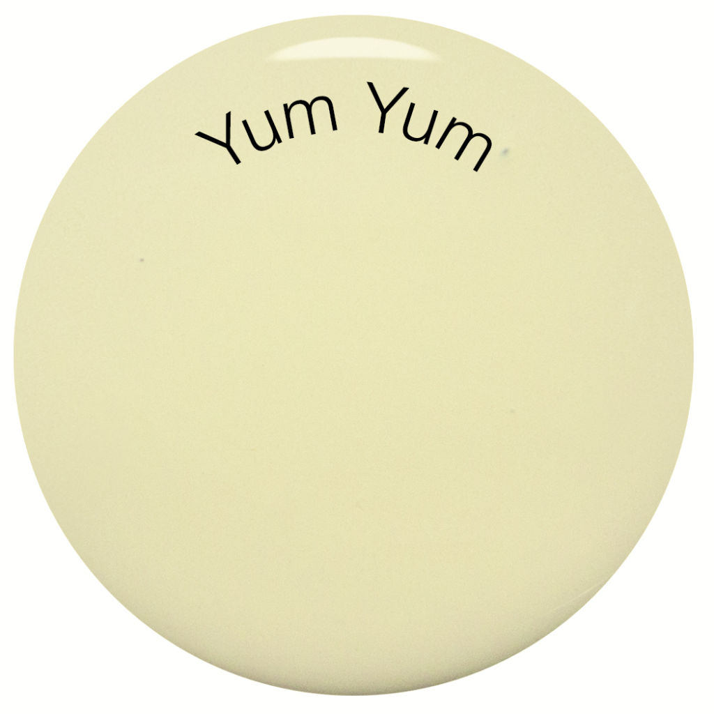
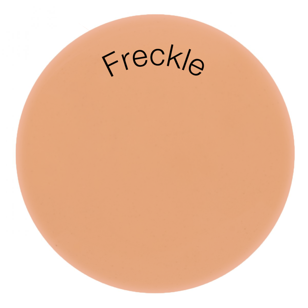
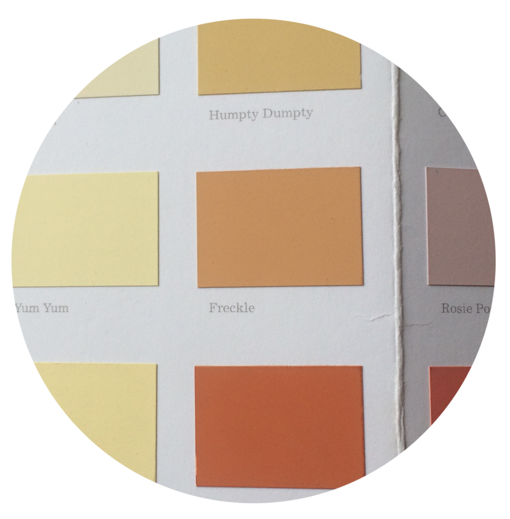
If you relax your eyes and take a look at these four yellows below, which are you drawn to? Is it the cool cleanliness of Posset, the quiet calm of Yum Yum (discontinued), Daisy Chain’s light playfulness or Freckle’s warm hug?
Once you’ve connected with your colour type we can start to look at it in context. Apart from art installations or clinical trials we would never see a colour on it’s own. It’s the relationships that resonate with us and we’re most at ease with the harmonising combinations that we’d see naturally occurring in the world.
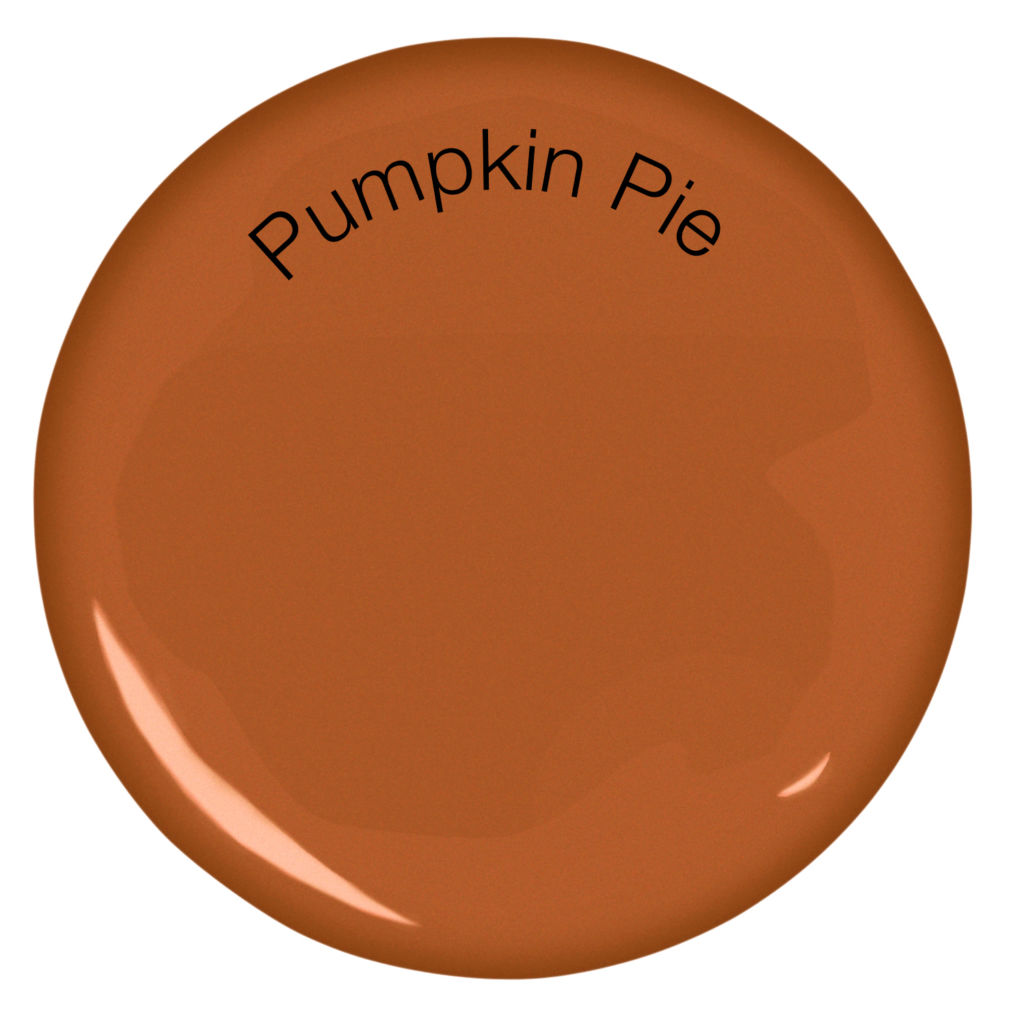
Let’s look at Freckle. It’s a yellow ochre at heart. Friendly and reassuring, it reminds us of warm sands, artisanal bread and untreated leather. It has that multisensory quality. When you pair this with other oxidised colours like Pumpkin Pie (discontinued) they enhance and complement each other perfectly.
Orange is generally seen as a fun colour, light, a little bit cheeky and playful. In Pumpkin Pie (discontinued) the earthy sienna undertones give it plenty of depth grounding it in the palette. This naturalness makes the tone feel more grown up, sensual and organic. A deep reddishness with high pigmentation like this makes it an exciting and energetic feature wall or hallway. I’ve got this on the back wall of our galley kitchen. Two large steel mirrors create width in this narrow space and stop it from becoming overpowering.
Finding your colour type doesn’t mean that you’re stuck running in one colour wheel direction. It’s all a question of balance. The Lido is a vibrant turquoise, a refreshing contrast with Freckle and Pumpkin Pie. It has a green quality that makes it feel open and unfettered by daily life. Far from the ethereal tranquility that’s perhaps usually associated with aqua, The Lido will see you out water-skiing with a huge relaxed grin on your face.
Colour trends from the high street
It seems we’re not the only ones embracing the eclectic feel of the Natribes trend. The high street is awash with colour! Here’s Justine’s top picks of the best interiors collections that complement the bold and natural tones of our Natribes colour palette:
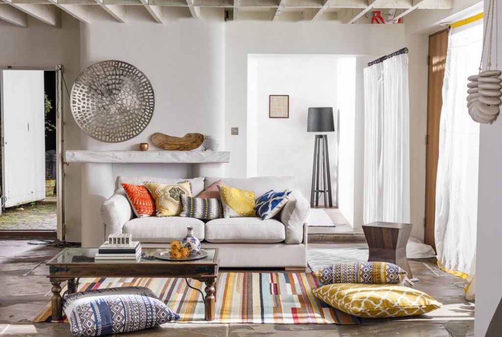
“The Fusion Collection by John Lewis brings elements of wanderlust to a neutral space with home accessories in earth-spiced colours.”
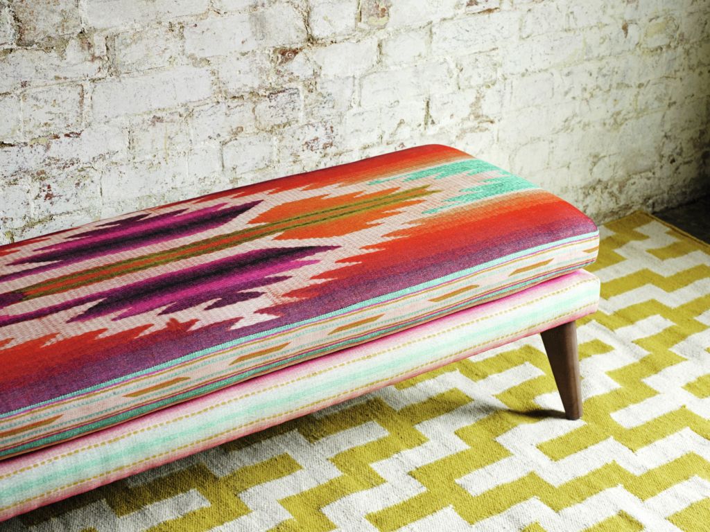
“Peruvian tapestry inspired vibrant colour and pattern for summer 2016 by Marks and Spencer. This ottoman creates a comfortable nook to encourage lively conversation.” In shades that are similar to the ‘Natribes’ palette, this ottoman showcases contrasting warm and cool tones.
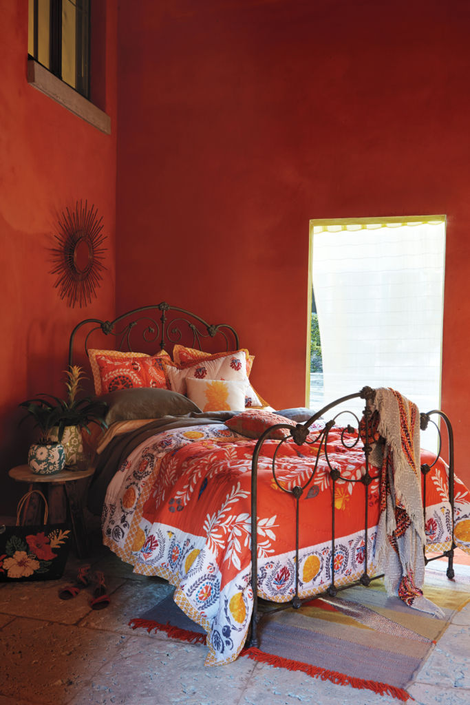
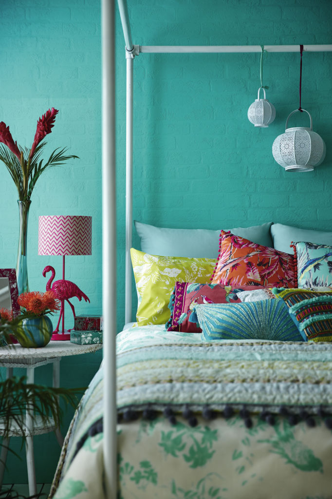
A tale of two bedrooms; this seductive orange from Anthropologie plays on intensity and heat while deep aquas set the tone for a refreshing wakeup from Debenhams.
If we’ve inspired you to be a bit braver with colour, click here to order your free Earthborn colour card of 72 handpicked shades.

