For bare porous unpainted masonry substrates such as lime plaster, stone, pebbledash & concrete.
£5.00
£34.50
£60.00
For masonry substrates with previous masonry paint application.
£52.00
£86.00
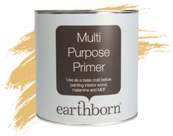
Earthborn Multi Purpose Primer provides a perfect base coat on interior wood, melamine and MDF surfaces.
£22.99
Our Colour of the Year 2026, Freckle, is rooted in nature and naturally warming.
Freckle’s rich, naturally occurring clay colour gives it not only a visual warmth but also remarkable versatility, allowing it to work beautifully alongside both bold shades and neutral schemes.
We’ve shared some of our favourite colour palettes to showcase Freckle’s adaptability and give you some inspiration for your home.
Freckle works wonderfully with whites that have a warm undertone.
If you have a more neutral or pared back home but you’re looking to introduce a little extra warmth, we’d suggest evolving your Scandi space by pairing the richness of Freckle with White Clay or Straw, both cosy neutrals that still offer a warm and inviting feel.
This colour scheme works well in both north facing and south facing rooms, making it a simple choice for any space in your home.
For a colour palette inspired by nature, and a lovely choice for south facing rooms, our nature inspired combination is perfectly balanced and organic.
It features our popular green Secret Room and our crisp white Flutterby, turning any space into a calming retreat.
Choose your favourite sunny, south facing room and welcome nature inside with Freckle.
Our playful palette blends Freckle with our fun, lively shades of Splashing and Rosie Posie.
This trio is perfect for adding a delightful pop of colour in bedrooms, bathrooms, or even upcycling projects.
These colour pairings work especially well in north facing rooms, as they add a playful warmth to spaces that can often feel cooler.
For a nostalgic colour combination that taps into retro-inspired interiors is a great addition to add some contrast in your home.
This palette combines the dark sky blue of Balloon Ride with the freshness of Tick-Tok.
It’s a beautiful bold look that would suit a living room or even a dinning room depending on the space.
Because of the contrast it’s a good choice of colours to use in rooms that lead into other areas of your home.
If you love Freckle as much as we do, enhance its fiery undertones by pairing it with Lady Bug and Peach Baby for a baked earth inspired palette that’s full of sophistication and just a touch of drama.
This fiery palette works best in south facing rooms, where natural sunlight brings out the warmth and glow in each colour.