For bare porous unpainted masonry substrates such as lime plaster, stone, pebbledash & concrete.
£5.00
£34.50
£60.00
For masonry substrates with previous masonry paint application.
£52.00
£86.00
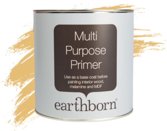
Earthborn Multi Purpose Primer provides a perfect base coat on interior wood, melamine and MDF surfaces.
£61.00
£22.99
After the festivities of Christmas its completely normal to feel blue in January. We are returning to work, waiting for our first payday of the year (which feels like a lifetime away) and the weather seems to be colder, darker and wetter than ever. That’s why January is the perfect month to overhaul your décor and curb those January blues using colours from our Claypaint range ready for the New year ahead.
Colours freckle and Walls paint in Flower Pot Claypaint
As we are in the middle of winter its easy to picture ourselves somewhere abroad where its bright and sunny. Although we can’t help you get on the next flight to the Maldives, we can certainly help you embrace the daydream all year round with some of our warmer shades of Claypaint.
For a taste of the Mediterranean why not try ‘Freckle‘ or ‘Flower pot‘? Both are distinctively reminiscent of warmer climes and are naturally occurring clay colours that can help bring that summer feeling indoors all year round. If those shades are a bit too daring for you, why not try our Claypaint in shade ‘Little Rascal‘? This beautifully rich beige colour has a softer warm undertone which appears almost biscuity and would be ideal for your living room, hallway, or bedroom.
You know that old saying fight the blues with the blues? No? That’s because there isn’t one but nevertheless there is some truth behind our theory. Blues have a tranquil and calming effect so incorporating this into our home can make for a relaxing environment.
Our palest of blues is ‘Bo Peep’ which is a subtle powdery shade of blue that would be ideal for bedrooms or bathrooms. ‘Polka Dot‘ is an Earthborn favourite that is a nod to the Wedgewood blue making for a super friendly and versatile colour bound to brighten up any room. For the bolder amongst us why not consider ‘Puddling‘ (now discontinued). This is our deepest shade of blue and perfect for those looking to make a dramatic statement. If you are looking to incorporate blue in your accessories and need a colour that would compliment this why not try ‘Whisker‘. This cool grey shade would be the perfect backdrop to provide a sharp contrast against any blue accents.
Colours Lady Bug and Hidey Hole (with crackle effect) in Claypaint.
Although embracing the darkness in an already dark environment sounds counterproductive, it really can be an effective way of creating a cosy nook in your home. ‘Hidey Hole‘ is a charcoal grey and is our darkest shade of Claypaint. When used in the whole room it really helps to create a cosy cocoon feel but if this seems too much of a commitment then try pairing with a soft neutral colour. Another statement colour to consider is ‘Lady Bug‘ which is a shade of claypaint that exudes sophistication and opulence. This colour wouldn’t look out of place in any room and is highly versatile for use in both modern and older interiors.
Whichever colour you choose a revamp is bound to make you feel brighter and happier and help to curb those January blues, even if it’s just the sense of completing a project. We really hope this blog has helped to inspire you, be sure to tag us in your completed projects with #Earthbornbyme.