For bare porous unpainted masonry substrates such as lime plaster, stone, pebbledash & concrete.
£5.00
£34.50
£60.00
For masonry substrates with previous masonry paint application.
£52.00
£86.00
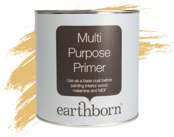
Earthborn Multi Purpose Primer provides a perfect base coat on interior wood, melamine and MDF surfaces.
£22.99
Paint has the power to completely transform how a room looks and feels. Whether introducing light to a darker space or injecting colour onto a blank canvas, choosing the right colour for a home can feel overwhelming at first – but it doesn’t need to be.
Interior stylist Maxine Brady and Gemma Gear, hosts of the popular interiors podcast ‘How to Home’, share their expert guidance to help homeowners enjoy the process and feel confident in their colour choices.
A good starting point is understanding light and its vital role in how a colour looks and feels once on the wall.
To get it right, start by figuring out which direction the room faces (whether north, south, east or west) as each orientation will alter the appearance of the paint colour.
“Natural light has a massive impact on how colour looks on the walls – and the direction your room faces can completely shift the mood of a space.”
Maxine Brady shares. “Ask yourself, do you use the room mostly in the mornings or evenings?
If it’s during the evenings when the room is darker, for example, you’ll want to consider what your wall colour will look like under artificial light rather than natural daylight.”
“In north-facing rooms, sunlight is often limited, so warm undertones are perfect, Humpty Dumpy is a golden mustard shade, helping to lift the naturally cool light in these spaces.”
Gemma Gear adds. “In contrast, south-facing rooms benefit from an abundance of natural light, making cooler shades more suitable.”
“A colour like Bunny Hop helps balance the brightness and prevent the space from feeling too harsh.”
To avoid any surprises, always test the paint before making a final decision. Paint large swatches directly onto the walls or use sample boards to view colours in different light settings throughout the day- keeping the sample up for at least three to seven days before deciding.
“Always get samples, but not just one! Choose three or four and paint big patches on multiple walls in key areas of the room, ” Gemma Gear advises.
“What looks perfect in a showroom can fall flat at home, so always use sample posts first before you make your final decision.”
“Different paint finishes will also respond in unique ways to both natural and artificial light.
Claypaint offers a luxurious ultra flat matt finish that adds richness and depth to the walls, creating a soft, velvety look.
Whereas the Lifestyle emulsion delivers a soft sheen finish that’s completely wipeable – ideal for busy, high traffic areas.” Maxine Brady adds.
The age and design of the home needs to be considered before choosing paint colours to ensure the property’s style is complemented correctly.
Whilst period homes can benefit from rich, heritage-inspired shades that highlight architectural features, contemporary homes can embrace bolder contrasts or minimalist schemes.
“New builds often need warmth added to them, so opt for bolder shades and use colour to add personality to those blank-slate spaces, ” says Maxine Brady.
“On the other hand, period properties such as Victorian and Edwardian homes, suit rich, dramatic colours such as Can-Can. The colour looks beautiful on its own, or alternatively, pair it with a timeless, chalky neutral, like Crocky Road for a playful contrast.”
A home should be a true reflection of the homeowner’s personality.
Think of each room as a blank canvas for creativity and follow a style that suits you. Whether you’re drawn to moody blues, playful pinks or soothing pastels, create a space that feels authentic and expressive.
“Colour isn’t only visual – it’s also emotional. Your home should make you feel happy the moment you walk through the doors, ” says Gemma Gear. “Forget trends or what others think. If a colour speaks to you, it’s the right one.
Whether you’re a minimalist who loves the neutral tones of Hopscotch or maximalist vibrancy of Delilah, the best palette is the one that feels authentic to you.”
We hope this helps you find your perfect paint colour that brings out the best in your space no matter the orientation.