For bare porous unpainted masonry substrates such as lime plaster, stone, pebbledash & concrete.
£5.00
£34.50
£60.00
For masonry substrates with previous masonry paint application.
£52.00
£86.00
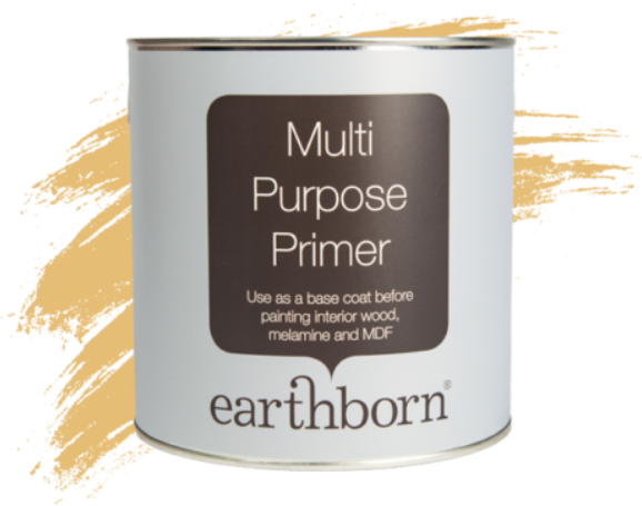
Earthborn Multi Purpose Primer provides a perfect base coat on interior wood, melamine and MDF surfaces.
£61.00
£22.99
When selecting paint colours for your home, neutral tones remain an enduring favourite for their versatility and ability to create a sophisticated canvas for any design style. Among these, one shade that stands out for its timeless appeal and adaptability is our Hopscotch.
Hopscotch, with its chalky and inviting nature, effortlessly integrates into nearly all interior design schemes. Its subtle warmth and understated elegance makes it an ideal choice for anyone seeking a refined, classic look for their walls and living space.
Hopscotch is a chameleon among neutral paint colours. It serves as an excellent standalone hue, infusing rooms with a sense of tranquillity and sophistication. Moreover, it acts as an exceptional framework for a diverse range of colour schemes.
Whether used as an off-white base or paired with creamy, warm, or soft whites, Hopscotch provides a reliable foundation for various design approaches.
The advantages of incorporating Hopscotch into your home extend beyond its aesthetic appeal. This versatile paint colour has the remarkable ability to create the illusion of larger spaces while fostering a cosy atmosphere.
Its compatibility with furniture styles, textures, and decorative elements makes it an excellent choice for any room in the house.
Hopscotch finds its place in various rooms throughout the home. It adds a calming effect to bedrooms, creating a serene retreat for relaxation and a good night’s sleep.
In living rooms, it provides a subtle backdrop for artistic expression, allowing furniture and accents to take centre stage. Moreover, in kitchens and dining areas, it serves as a neutral canvas for culinary creativity and vibrant gatherings.
Hopscotch is an ideal colour choice in north-facing rooms as these room orientations are usually cooler and Hopscotch helps to add warmth and brighten up the space.
It’s also great for a burst of energy in the morning in south-facing rooms as it warms the room and makes up for the lack of morning sun.
The beauty of Hopscotch lies in its compatibility with a wide spectrum of colours. Pairing it with warm beige tones enhances its earthy allure, while soft white combinations create a serene and elegant ambience.
Choosing a bold or bright pop of colour only enhances Hopscotch as it easily holds its own amongst bolder colours like our Lady Bug or Flower Pot.
Whether you prefer warm whites or creamy tones, Hopscotch serves as a versatile base for your colour palette. Indulge in our favourite colour combos for Hopscotch – we have palette inspiration for everyone.
Unlike stark white tones, which can sometimes feel clinical, Hopscotch introduces a gentle warmth that adds depth and character to the space. Its muted tones offer a cosy ambience without sacrificing the airy feel associated with neutral colours.
Overall Hopscotch emerges as an exceptional neutral paint colour for anyone seeking a timeless and sophisticated palette for their walls.
Its adaptability, serene demeanour, and compatibility with various colour schemes make it a versatile and enduring option for creating inviting and elegant spaces.
Whether as the primary colour or a supporting element, Hopscotch effortlessly elevates the ambience of any room, promising a lasting allure that transcends fleeting trends in neutral paint colours.